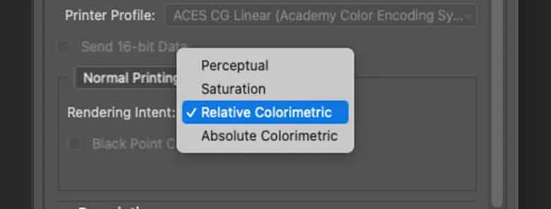
When you send an image to print in Photoshop or any other image editing software, you will see a tick box or drop-down list titled ‘Rendering Intents’. Discover what Rendering Intent when Printing means and find out how it can dramatically improve your prints.
What is Rendering Intent?
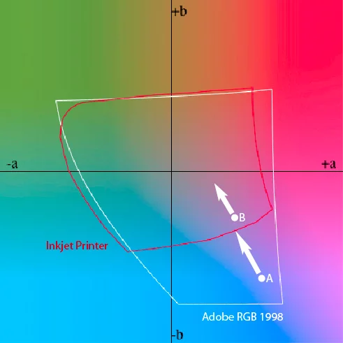
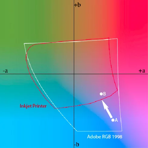
When applying a profile for print, there will be colours that are in gamut of the source profile of your image (e.g., Adobe RGB (1998)) but out of gamut of the destination ICC profile. In this situation, the out of gamut colours need to be brought into gamut. A rendering intent is a method of converting the colours.
For photographers, the only time you need to choose a rendering intent is when you use an ICC profile in Photoshop, Lightroom or other imaging software. Many sources will tell you to always use one rendering intent, but if you always choose the same one then you are missing out on a technique that can really enhance and optimise your inkjet prints.
What are the Rendering Intent Options?
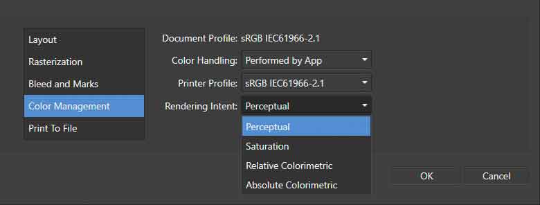
The 4 options available when selecting which Rendering Intent are Perceptual, Saturation, Relative Colormetric and Absolute Colormetric. Below breaks down what each one means.
Perceptual
When transitioning from large to small colour spaces, people typically employ ‘Perceptual’ rendering, which scales the source colour space into the destination space.
The ‘Perceptual’ rendering process shrinks the colour gamut of the source profile to fit within the smaller volume of the destination. It changes all colours, compressing the gamut, much like removing air from a balloon to fit it into a box.
Perceptual rendering maintains the relationships between colors, ensuring that color saturation remains consistent compared to other colors, even within the smaller destination gamut.
Saturation
The ‘saturation’ rendering intent is similar to ‘perceptual’, but it will usually make the colours more saturated. The effect is quite subtle and very usable for images where you want to enhance colour saturation. To continue the box analogy from above, imagine deflating a balloon slightly to get it in the box and then re-inflating it so it fills the box as much as possible.

Relative Colormetric
‘Relative colorimetric’ ensures the colours that are already in gamut are reproduced as accurately as possible. However, colours that are out of gamut just get translated to the closest possible colour that is in gamut. They get clipped to the outside edge of the colour space. This means that two different colours in the original could end up being nearly the same colour in the rendered version. As an analogy, it’s like slicing a ball to get it to fit in to a box.
Absolute Colorimetric
As a photographer, never use ‘absolute colorimetric’ – it’s only for pre-press proofing!
What is Black Point Compensation?
When using rendering intents in Photoshop, you will also encounter an option called ‘Black Point Compensation’. You should always use it because it converts the tonal range of the source colour space into the tonal range of the destination to avoid tones being clipped. Lightroom and other Adobe software always utilize it, even when it isn’t visible as an option.
Which Rendering Intent to use and When?
Anybody that tells you to only use one rendering intent doesn’t fully understand how they work. Which one you should use depends on the image, the source colour space, and the destination colour space.
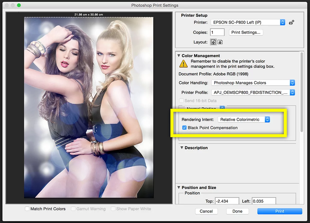
Let’s imagine you are using a very good semi-gloss paper like PermaJet’s FB Distinction 320gsm to print a variety of photos with the below features.
Subtle Tones
You have a nice shot from the studio of two models with subtle tones in the background. There’s grey background, flesh tones and soft hair. These colours may well be in gamut of the printer so the ‘relative colorimetric’ option would be an appropriate choice.
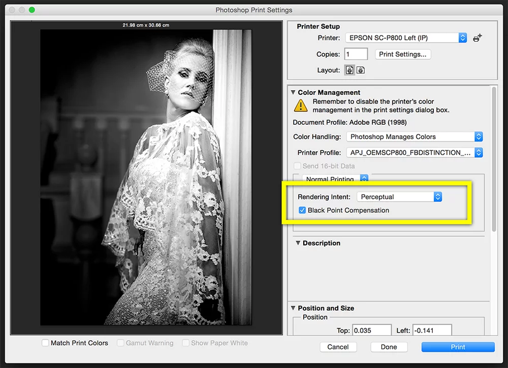
Block Tones
You have a picture of a bride in her white dress against a dark background. To retain the detail in the dress and still have detail in the shadows, the ‘perceptual’ option might be best.
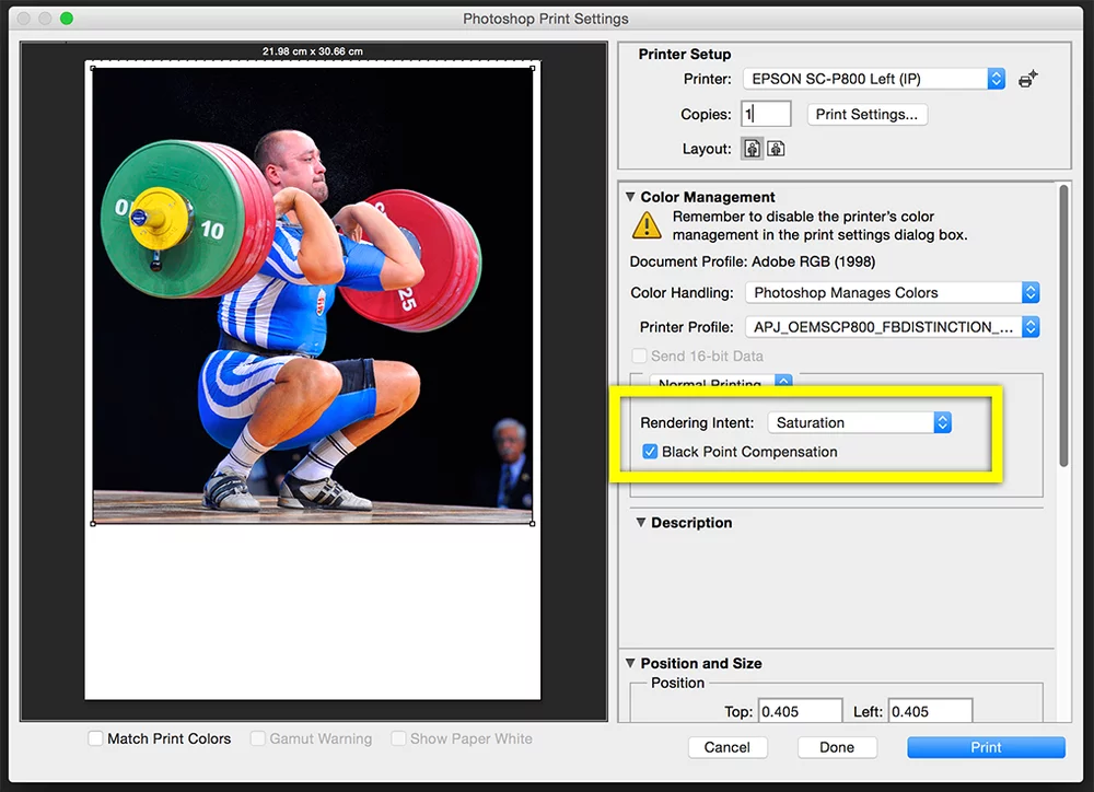
Punchy Colour
Here you have a picture with bright colours across different areas. To deliver as much punch in the colours as possible, choose the ‘saturation’ option.
Landscapes
You have just taken a landscape shot in an autumnal wood. There’s varied colour in the foliage with lots of contrast from sunlight streaming through the trees. You are printing on a beautifully smooth, matt surface like PermaJet’s FB Matt 285gsm. For this you should try all three intents to see which gives you the most pleasing print. Each will be slightly different, and each intent may just bring out some part of the image slightly better than the others.
Other Factors to Consider
Gamut Warning Functions
You can often use the gamut warning function in Photoshop or Lightroom along with the soft proofing function to help you decide which rendering intent might be best. Lots of out of gamut colours might imply the shot would look best printed with ‘perceptual’ or ‘saturation’. If few colours are out of gamut, then ‘relative colorimetric’ may be suitable.
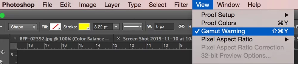
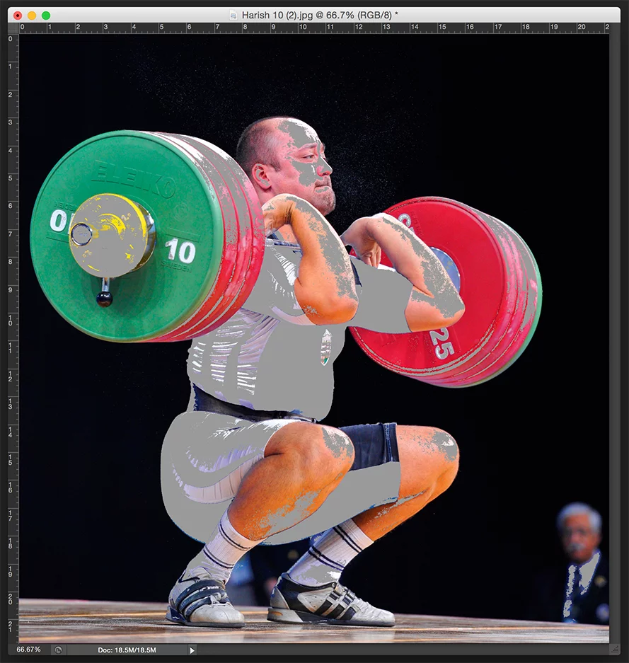
A gamut warning view (such as that in Photoshop, above) will show up something like this. Grey areas indicate colours that are out of gamut. The image above has large areas of out of gamut colour, so printing with the ‘perceptual’ or ‘saturation’ option may be most suitable. Images with little out of gamut colour may be more suitable with ‘relative colourimetric’ option.
Colour Space
The image’s colour space can also influence the outcome. If you use a small colour gamut working space like sRGB, you may notice minimal differences between the intents because much of the camera’s colour information has already been lost. However, if you utilize Adobe RGB or ProPhoto RGB, or process images in software with a wide gamut working space like Lightroom, you’ll observe more significant variations.
Inkjet Paper
Generally, the glossier the paper the larger the colour gamut. So, if you are using a gloss or semi-gloss paper, more colours from an image may be in-gamut. Likewise, if you are using a matte paper then you may get more benefit from trying ‘perceptual’ or ‘saturation’. This because more colours may be out of gamut (depending on the image of course!).
In Conclusion
You may find it frustrating that we are not recommending one rendering intent over another, or that colour management offers so much choice rather than straightforward accuracy. When converting colors into a smaller color space, you must make compromises. Having a choice of rendering intent empowers you to prioritize what YOU value in the image: contrast, saturation, accuracy, or highlight/shadow detail.
Selecting the right rendering intent adds another tool to your arsenal, empowering you to achieve optimal results every time you hit ‘print’.
Still confused?
If you are still confused or would like to learn more regarding anything in the world of inkjet paper or printing, please don't hesitate to get in touch.